


How to Design a Superhero Costume for Comics
Part One (of Two)

Aloha all!
Welcome to today’s article, the first of two, about designing superhero costumes!
Designing superhero costumes is actually my favorite aspect of the entire comic book process. It’s the stage where characters first come to life, so to speak.
Much like drawing comics itself, superhero costume design is a skill. It’s a process of making deliberate and conscious decisions about your superhero’s costume and/or their overall look. The goal — and the function — for every superhero costume is to inject appeal and to communicate who that character is.
There is no singular or right or wrong way to do it because many different creators have different approaches of their own. However, simply putting random ideas together is arguably the least effective way to do it because it generally leads to their character’s design looking incomplete or it otherwise fails to communicate to the viewer who the character is. In such instances, the design’s impact tends to be lessened. Most creators have a process to how they design costumes, and for many, there is — pun intended — an art and even a science to creating costumes. The characters who have the best designs tend to have elements and components of it that well-thought out and well-executed, where the individual parts work synergistically to form an amazing — if not perfect — whole.
Because many creators have different approaches, not every one fits other creators’ approaches, so it is a good idea to have generalized guidelines that can inform all facets of your design and streamline your process, no matter your superhero.
With that in mind, I’ll break this article into two, the first focusing on identifying ad proposing three guidelines that anyone can use and the second one will be on how to apply the guidelines of the first article into your design and decision-making process, allowing you to make deliberate choices about specific elements of your superhero’s design.
Before we get to identifying specific guidelines to use for superhero costumes, one must know what a superhero is.
The best definition that I’ve seen comes from Wikipedia:
A superhero or superheroine is a fictional character who typically possesses superpowers or abilities beyond those of ordinary people, is frequently costumed concealing their identity, and fits the role of the hero, typically using their powers to help the world become a better place, or dedicating themselves to protecting the public and fighting crime.
It hits every criteria that constitutes a superhero:
They typically possess superpowers or abilities.
They have a dual identity — that of a civilian identity and a costumed identity.
They use their powers to protect others and fight the bad guys who would do them harm.
By understanding what a superhero is, one can use that knowledge to inform their design decisions. After all, just about every superhero costume is the visual basis of one of the dual identities they have, so understanding these things is key to the whole process because half of the job of every costume is to communicate who the character is to the viewer.
The other half of that job, of course, is injecting appeal. Like with knowing and understanding what a superhero is, one much know what appeal is:
A great definition of appeal is:
Appeal - verb
appealed; appealing; appeals
1: to arouse a sympathetic response
an idea that appeals to him
Appeal is a tricky one because it’s a very subjective matter. What appeals to one may not to another. However, there is a great way that we can discern appeal for superhero costumes, which is by studying the costumes that have stood the test of time (as well as those that are horrible) because they can tell us what works best and why more than most. In other words, the iconography of superhero costumes. After all, great costumes can’t really stand up to the passing of decades unless they appealed to a decades after decades of a wider audience.
By studying the ones that have succeeded, one can easily glean insights into what has worked and what has appealed to a wider audience. When you glean specific elements, you can then form a guideline that can inform every facet of a superhero’s design and more effectively pick and choose elements that come together to form an appealing design — as well as elements that tell the viewer who the character is.
By using my own personal study of superhero iconography, I will present three such guidelines that you can follow.
From the Golden Age to today’s modern designs, with rare exception, I’ve found one factor to be true about pretty much all of the greatest superhero costumes: No matter the design or the costume, virtually every great costume has the presence of a…
THEME.
A superhero’s costume’s theme usually does the heavy lifting in telling us who the character is and it is usually based on two of these elements below, whether one or the other — or both of them combined:
The Superhero Name
Their Superpowers
You’ll notice that both criteria were in the list above about what defined a superhero. This is because more often than not — done well, of course — the theme of the costume will communicate who the character is and what their powers are to the viewer.
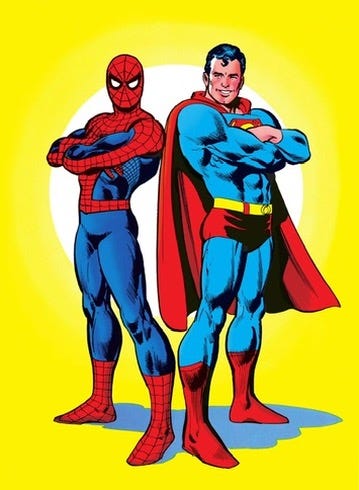
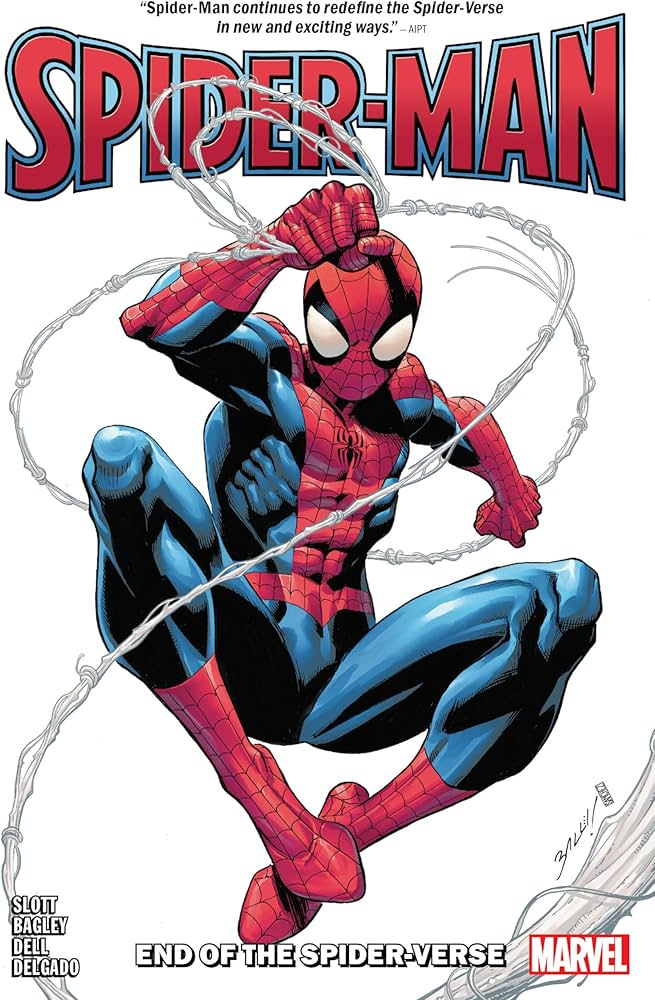
Spider-Man is my favorite example of this.
With the spider on his chest and the webbing pattern in the red parts of his costume, along with his trusty web-shooter, they clearly spell out that he is a spider-themed character, one with the powers of a spider.
Think of all (or some) of the greatest and most iconic superhero costumes that we have ever seen. They pretty much all have a theme. Superman, Batman, Wonder Woman, The Flash, Green Lantern (Hal Jordan), Spider-Man, the Fantastic Four, Iron Man — etc., etc., etc.
Yes, virtually all of them.
Due to its near-universal appearance, it is perhaps the single most basic aspect of creating a superhero costume and probably should be the first thing we think of when doing so. Unfortunately, there has been a trend, whether at the pro ranks or in the indie comics sphere (which I use to refer to small publishers or independent self-publishers), where many modern creators have fallen into a trap of designing with appeal as the sole objective. The trouble with that is that they often fail to communicate who the reader is to the viewer because they neglected to include an apparent theme. (Sorry, I’d provide examples, but I don’t want to name characters or creators by name.)
By using a theme, half of your work is done because, as I mentioned above, you will have a readily available element that will go a long way in telling the viewer who your character is. From there, the rest of your work is on creating appeal.
That is why, despite its prevalence in all of the great superhero costumes, theme alone as a design factor is generally not enough. Even with the aforementioned examples of the most iconic costumes, I’ve found that a costume’s theme is almost always paired with another factor or element, one that provides and/or elevates the costume’s appeal into a lasting and timeless design.
As such, each of the three guidelines below will pair theme with another potent element. Let’s start with the most common combination that I’ve found:
GUIDELINE #1

As mentioned above, a theme is the best and most common way to communicate who the character is and what their powers are to the viewer.
Meanwhile, a focal point is exactly that: The point from which the entire costume flows or otherwise draws the eyes in. Without one, a costume will often look incomplete or unfocused.
A focal point will usually be on the character’s chest, which is one of the best places on the human body to pull the whole look together. It can however, be on places like the head or the abdomen.
The majority of times the focal point will be the character’s logo, one that’s tied directly to their name. The reason for this is that a logo is the character’s branding or identity. In such cases, you will naturally want this to be the focal point of the entire costume.
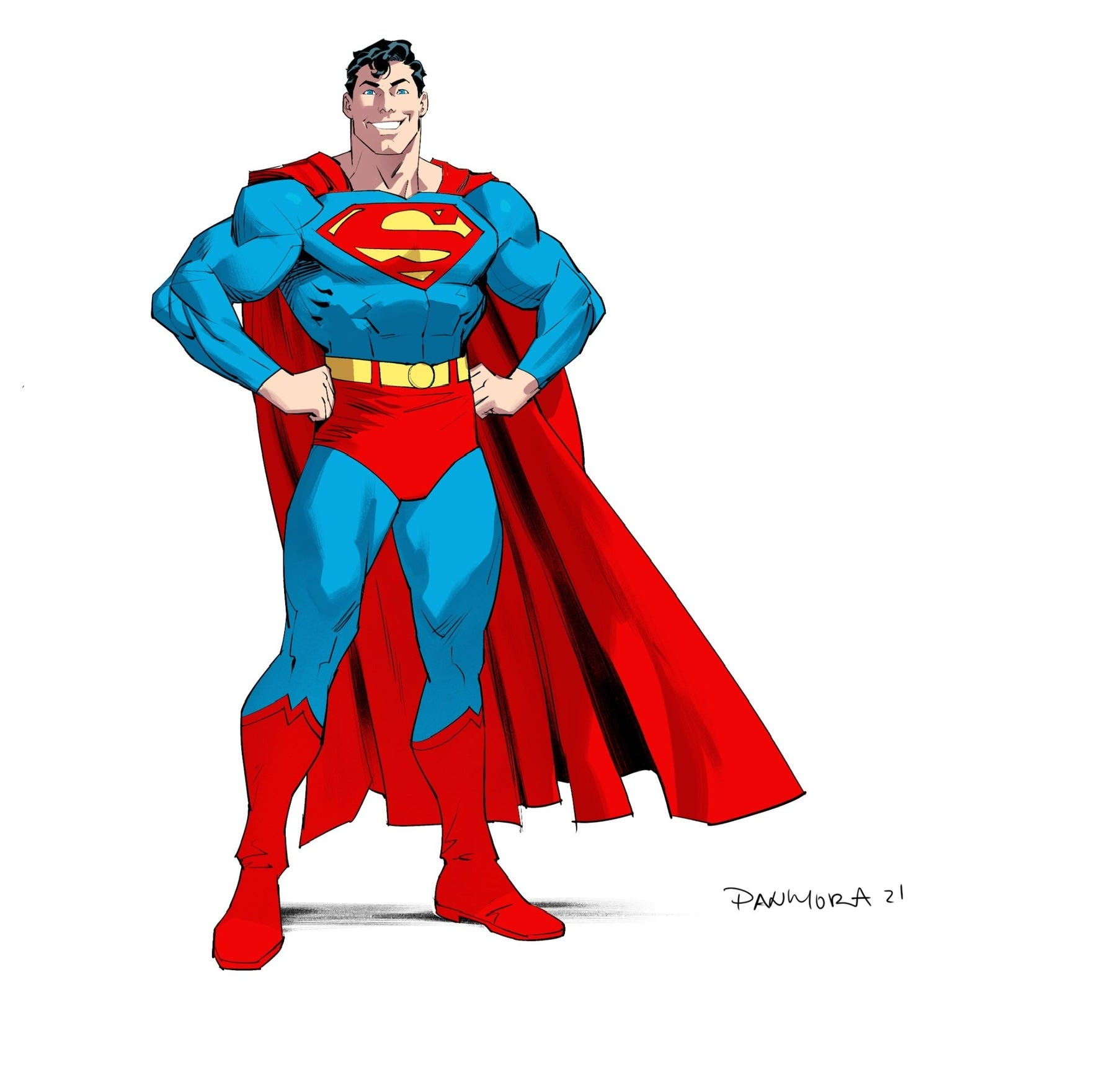
Take Superman... everyone knows about his iconic “S” shield. His entire design flows from that single area on his costume.
Allow me to demonstrate my point. Let’s remove the “S” logo from his costume, which gives us this…
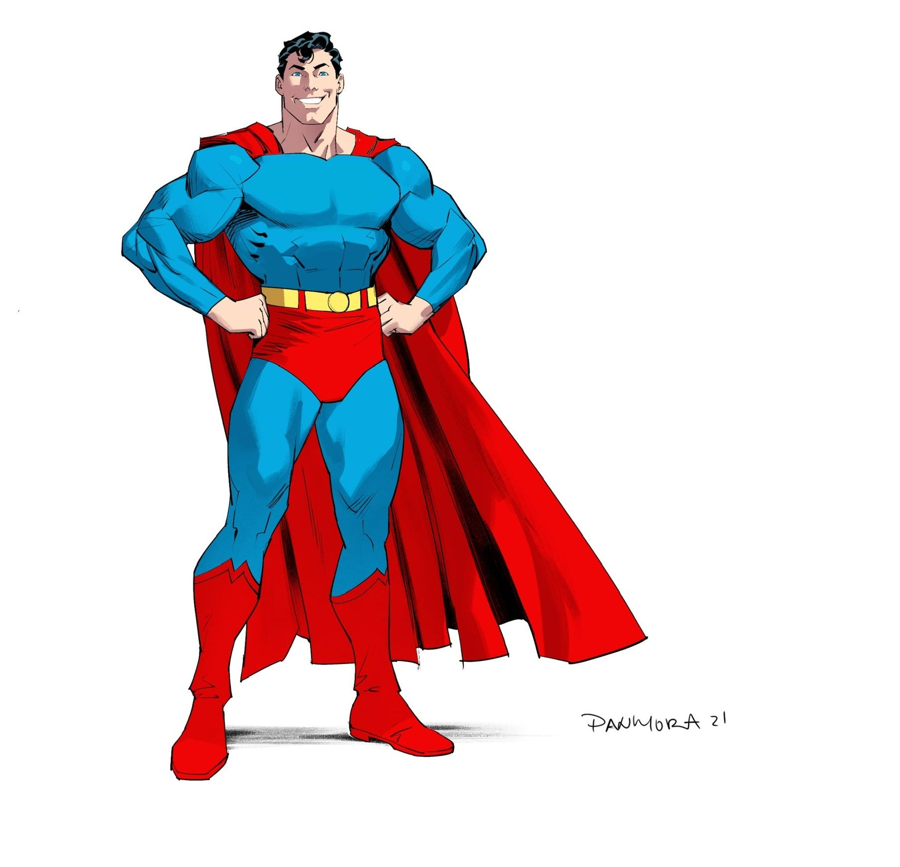
That’s a world of difference, right?
As you can see… even with the cape, trunks, yellow belt, red boots and blue pants and long-sleeved shirt — all great elements that help complement Superman’s entire design and all of which helps to form a theme — it looks quite incomplete without the “S” shield. You’ll find that there’s nothing on the costume to center your gaze.
That’s the power of a focal point. It can either create or elevate a costume’s appeal.
Indeed, there’s a reason that the combo of a theme and a focal point — again, usually a chest logo, one tied directly to their name — is so prevalent in so many of the greatest superhero costumes — it’s that potent. Let’s revisit a couple of the aforementioned examples:
Batman’s theme is based on bats and his chest logo is a bat.
Spider-man is the same, but with a spider.
Captain America, same, but with the star logo on his chest and the “A” on his head.
So on and so forth. You get it.
You might have also noticed that the names I just listed are also some of the biggest names — the elite A-listers and/or the icons — of the superhero genre. That’s no coincidence. That’s how big of an impact that superhero costumes can have on a character’s reception and popularity. All of those costumes were thought out. None of them just had random things slapped on it, one after another.
One of the biggest reasons why Guideline #1 is so powerful is that it automatically fulfills the very function of what every superhero costume is supposed to do: Inject appeal and to communicate who that character is to viewer.
Now, changing gears a little, I would be remiss if I did not mention that not all superheroes have their logos tied directly to their name. Sometimes, it’s tied to their powers.
Think of the original Captain Marvel (the Billy Batson one). He has both a theme and a focal point. A close examination of his costume reveals that the costume is based on the “Captain” part of his name, giving you a military theme, but the lightning bolt on his chest is based on the magic lightning that changed him from Billy Batson to Captain Marvel (and vice versa) whenever he called it down.
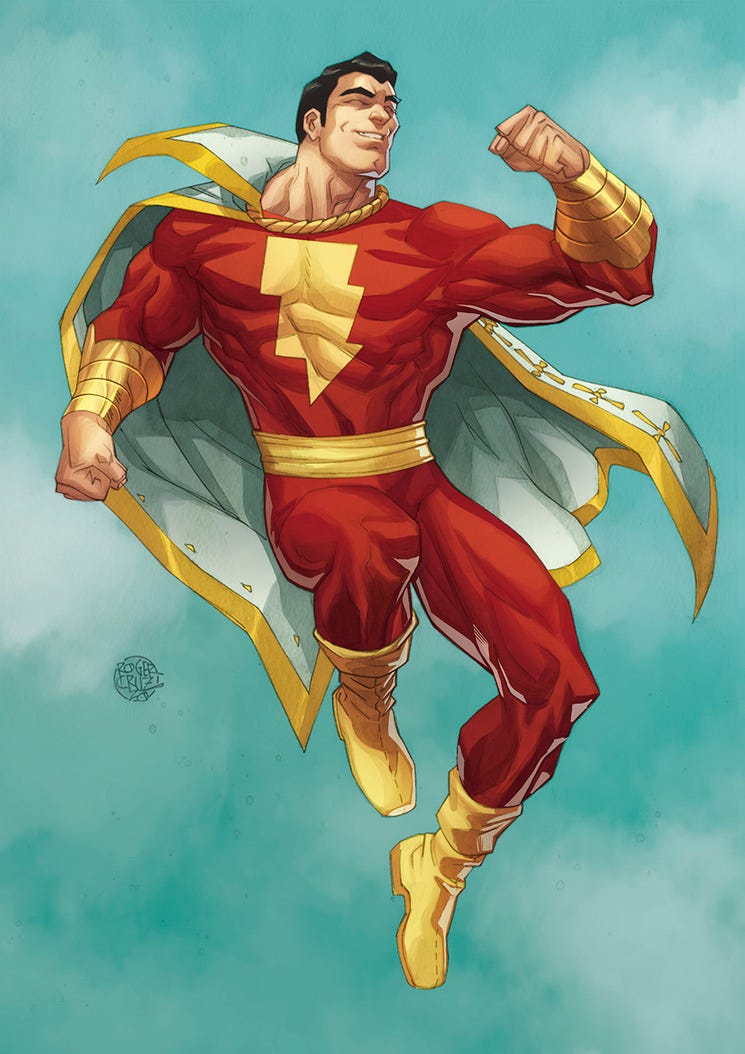
Because of this military theme, Captain Marvel’s original (and classically long-standing traditional) costume took its cue from historical military conventions.
Per C.C. Beck, co-creator of Captain Marvel:
“Captain Marvel’s was an operetta-style uniform. He wore a sash, a jacket-like top, tight pants (not tights), and had a small, braid-trimmed cape slung over one shoulder when he first appeared…
Captain Marvel’s so-called ‘arm-bands’ were his Captain’s sleeve marks, showing the rank of a Captain. Few people — artists, editors, or publishers — ever understood this or the fact [that] the decorations on Captain Marvel’s cape were the ornamental buttons and braiding used on military outfits…”
Ultimately, Captain Marvel’s costume had a clear theme and a focal point in place, making it timeless and impactful design that has yet to be bested. Granted, when Captain Marvel was created, he was originally going to be called Captain Thunder, which would have tied the logo directly to his name, making belong to the first category above. Alas, it was changed to Captain Marvel in the design process before he debuted in WHIZ Comics #2…
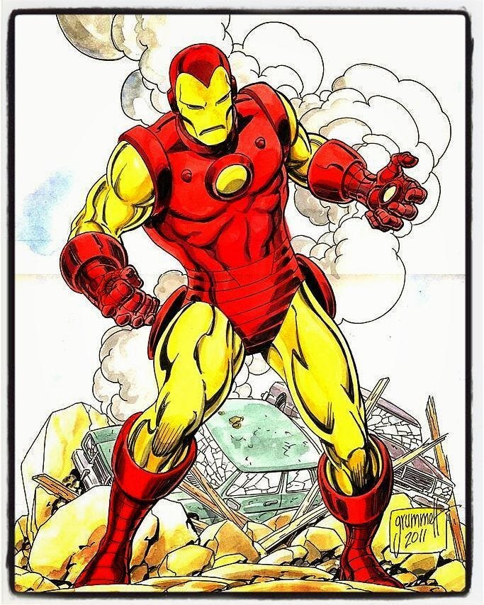
Another character that follows a similar convention is Iron Man. Like Captain Marvel, his costume — or rather, his armor — is metal, giving you his theme (relatively speaking) in addition to a focal point. That is, the focal point is his armored chest plate, the device that keeps his heart beating (at least originally).
Many indie comic book creators, whether knowingly or not, whether deliberately or not, follow Guideline #1’s principles. One of my favorite examples is Midnight Tiger.
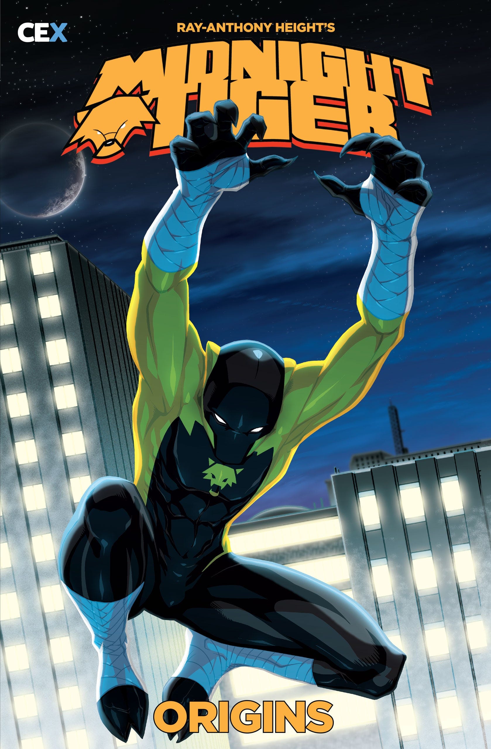
Created by Ray-Anthony Height, a professional comic book artist, Midnight Tiger’s costume comes with elements that imply its theme. Tiger-like ears on a cowl, claws on the fingers, and footwear with a feral-implied outline. Even the colors feed into the theme of the character; black to feature the “Midnight” in the name and orange for the “Tiger” part of it. To go with those elements, Midnight Tiger has a focal point, a feline-shaped logo on his chest logo, one that, like the great costumes above, ties directly into his name.
Midnight Tiger’s costume is a great example of having appeal and of communicating who the character is to the viewer, which, again, are both things that every superhero design should accomplish. Indeed, all of your design decisions should be met with these questions: “Does this look cool? And does clearly communicate who the character is to the viewer?”
A superhero costume can lose much of its impact if it’s simply a cool looking costume, but doesn’t communicate who the superhero is to the reader — or vice versa. Without naming names or citing which characters whose costume I feel execute on both fronts, I have seen a lot of pro and indie superheroes whose designs were clearly thinking about only one of them. In some cases, some designs showed no thought to either.

Moving forward, it must be mentioned that not all costumes have a focal point. In the absence of one, what can you use?
That brings me to…
GUIDLINE #2:
Guideline #2 is perhaps the second most prevalent combo to be used. There are many examples of famous and iconic superhero costumes where a costume is simply its theme combined with an uncommon or unique element.
A perfect example is Wolverine’s iconic yellow and blue costume.
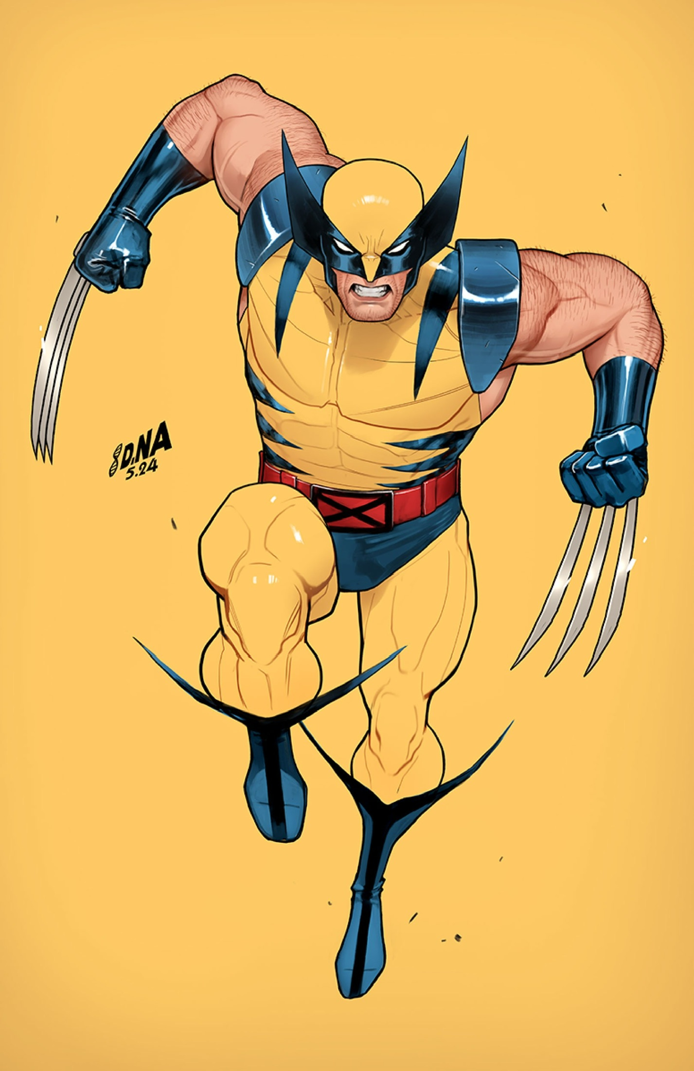
As you can see, Wolverine’s yellow and blue costume has a theme, one that refers to his namesake. The design has:
A black, feral-shaped part of his cowl that implies an animalistic element to his costume.
Relatively fanged canine teeth.
Long-eared boots.
Slash marks along the torso of his costume.
All of those elements are direct reflection of his name being Wolverine.
However, there’s no focal point in Wolverine’s costume in the same way that characters like Superman have. Instead, he has an element that elevates his entire look, a specific thing that is unique out of thousands and thousands of superheroes.
If you’re like most comic book fans, you know what I’m talking about:
Wolverine’s three-pronged adamantium claws.
The claws elevate and make Wolverine’s design appear more complete. His design is impacted when its shown without the claws. Lets take a look at what it looks like without…
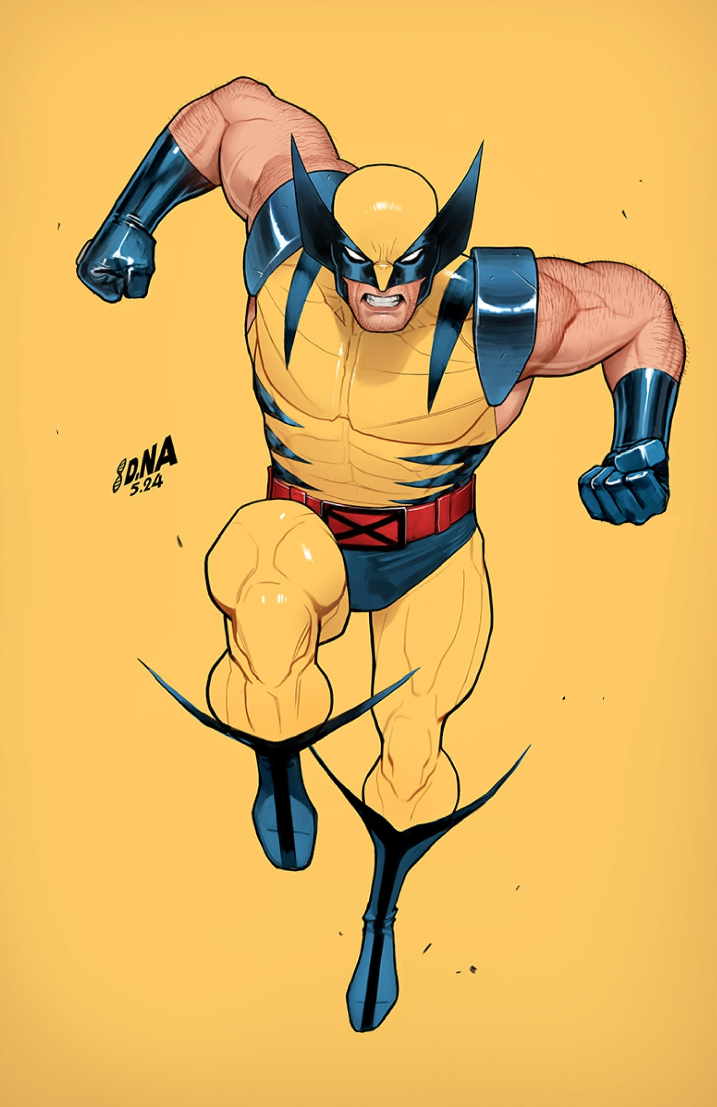
Still a cool design overall, but it is impacted by its absence, the way it often is when Wolverine’s claws are detracted.
Ultimately, Wolverine’s costume follows Guideline #2 and it does exactly what every superhero costume should do: Inject appeal and communicate who the character is.
Another superhero who follows Guideline #2 is Silver Surfer.
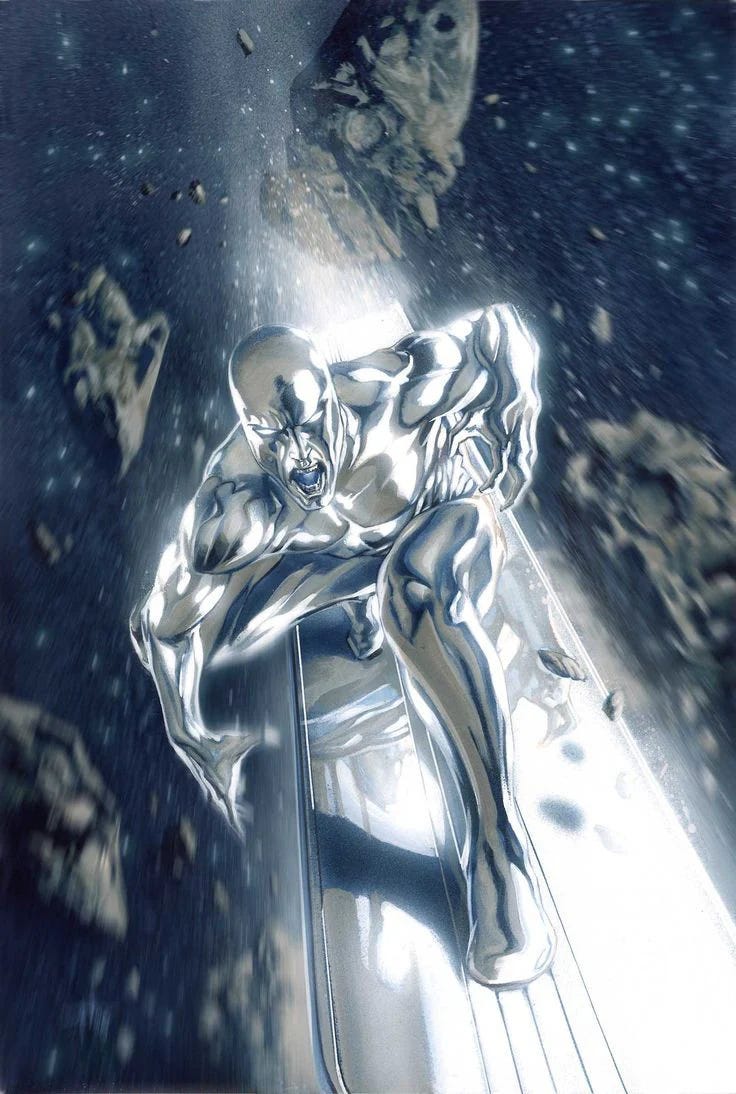
Like Wolverine, Silver Surfer’s design has no focal point, and like Wolverine, Silver Surfer has unusual elements about his design that you won’t find anywhere else: A silver skin on both his naked form and a silver flying surfboard.
As such, it also informs us the thematic side of Silver Surfer’s design, which draws solely from his name. In fact, I daresay that even if you didn’t know his name, you’d be able to easily guess it. (I should mention: In his early designs, Silver Surfer had trunks, but Marvel has long since eschewed it in favor of a naked form for Silver Surfer, which simplified and streamlined Silver Surfer’s look).
Indeed, Guideline #2 can be found in many of the most famous mainstream superhero designs, such as Nightcrawler, Colossus, Beast, The Thing, and Green Arrow (the Neal Adams design).
In the indie comics sphere, an excellent example of Guideline #2 is Dragonfly from Star Ward Comics.
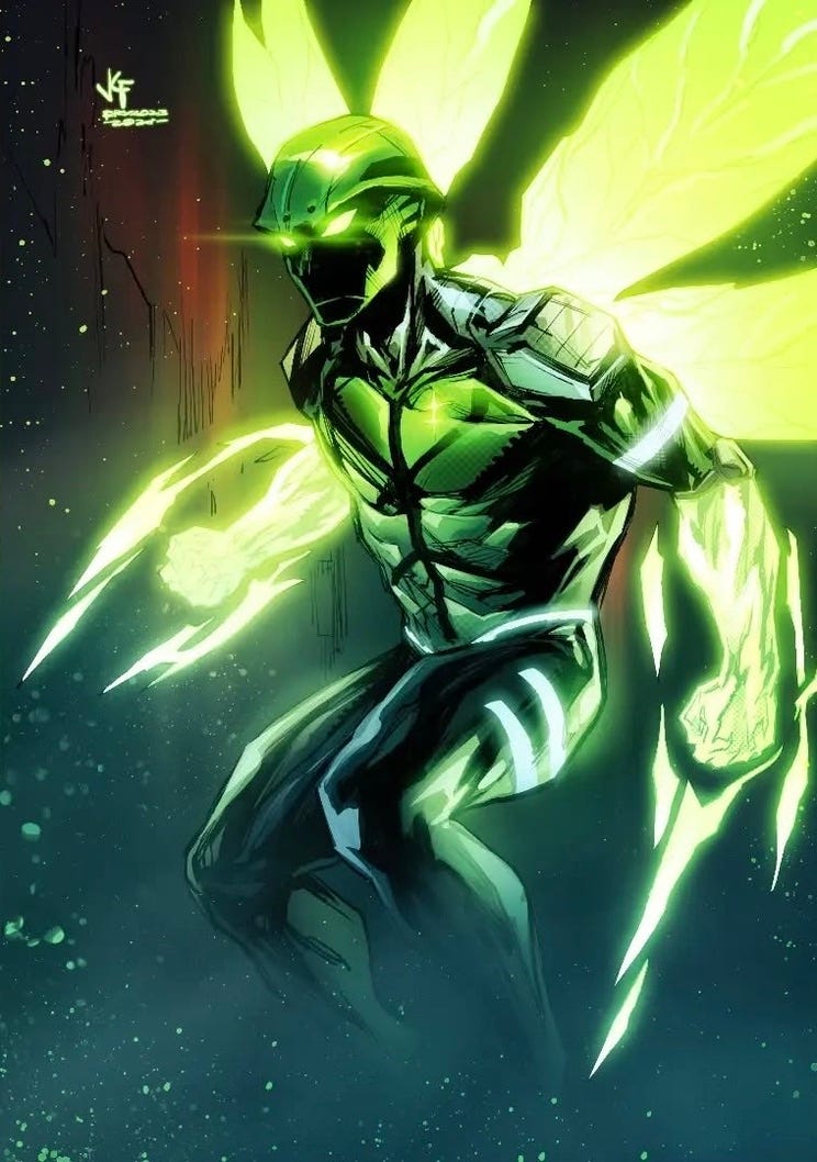
Originally created by Mike Tener, Dragonfly’s costume above — or rather, his armor — was designed by Keithan Jones. More of a sci-fi spy character than an outright superhero, Dragonfly’s armor borrows enough conventions from the superhero genre to be mentioned here, particularly when you factor in the fact that some superheroes’ costumes are sci-fi armor like his.
Dragonfly’s armor doesn’t much resemble a dragonfly per se, but it does contain some elements that suggest it, such as a small logo of a dragonfly on his left chest, it sometimes has wings similar to a dragonfly behind him, and it has a helmet with something of an insect-like appearance. Even the color green is no accident. A lot of dragonflies have a green color on their body, including the most common dragonfly, the common green darner dragonfly. From this, you can discern an insect — if not a dragonfly — theme, enough to start giving you a sense of who the character is.
To go with his dragonfly theme are two unique features of the costume not found anywhere: His helmet design and the green glowing distal portions of both of his arms, which, like the Wolverine example above, the uniqueness of them elevates the entire look. Without them, the overall design, while good, would not have been as strong and would not have made his design stand out as well as it does (particularly if one were to compare it to some of DC Comics’ Green Lantern characters).
Ultimately, with the aforementioned theme and the unusual elements of Dragonfly’s costume combined, both fulfill the function of every costume design, which is to inject appeal and to tell the viewer who the character is.
All of that said, sometimes, you may have a design in mind that doesn’t follow either Guidelines #1 or #2, so what is an alternative option?
Enter…
GUIDELINE #3
Modern superhero designs have steadily trended in the direction of more complex and/or practical costumes, so this combo may came as a surprise to many modern superhero fans.
However, believe it or not, historically, simplicity is and has been one of the most powerful and reliable elements in creating the greatest superhero costumes, even in this day and age.
The reason for this is that it’s the principle of minimalism. Simple designs are easy to digest, leading to a greater likelihood of a favorable response. That, and with less clutter, intent is far more easily conveyed and communicated.
Simply put, less is more.
Indeed, convoluted or complex designs tend to be busy and/or cluttered, causing the viewers to be overwhelmed by the many details. The more information given to the viewer, the more likely they’re going to ignore a lot of it to focus on a simpler or easier focal point or aspect of the costume.
This principle is true even with the characters that fall under the category of Guidelines #1 and #2. Many of the most iconic costumes draw a lot of their design strength on the basis of how simple they are. Superman, Spider-Man, the original Captain Marvel, Green Lantern (Hal Jordan), Wolverine, Silver Surfer, Nightcrawler, Daredevil, the Fantastic Four, etc. are proof of this. Even famous or well known superheroes outside of Marvel and DC, like Space Ghost, Invincible, The Fox (the J.M. DeMatteis one) and The Incredibles are greatly served by their simplicity.
Complex and/or convoluted designs have something of a track record of eventually being redesigned and ultimately not returning to their original or most classic forms, something that’s especially true in this day and age, where costume redesigns are rampant. Even when complex designs debut to great fanfare, they tend to not have staying power. The 90’s Extreme era and the New 52 era serve as prime historical examples. Of course, some complex designs, like Spawn’s, have staying power precisely because they’re complex, but this is not usually the case.
Meanwhile, historically, classic costumes that are simple have a better track record. Yes, they may get redesigned — as many have — but almost inevitably and invariably, they return to their classic outfits.
Additionally, before Superman godfathered the superhero genre as we know it today, I’ve found that the combo of theme and simplicity was more prevalent in the designs of costumed do-gooders than the two combos mentioned above, a testament to its lasting impact.
The perfect example of this is the Phantom, who preceded Superman by two years.
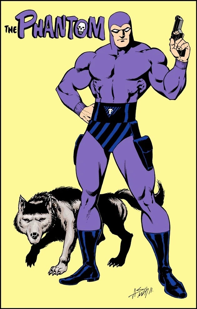
The Phantom’s costume is pure simplicity. It’s basically a long fitted purple suit with a belt, a pair of trunks, boots, gun holsters, and a mask. That’s it. The most complicated part of his design are the trunks that have diagonal lines and the skull crest on his belt and even those are pretty simple in terms of visual information. Nothing about the costume overwhelms with an abundance of detail.
Despite the simplicity — or maybe because of it — The Phantom’s costume’s theme jumps out at you on just the color and the small skull alone. It ties directly into the character’s name and reinforces the concept of the character with that of a ghost or a mysterious crimefighter, one that’s more myth than man (even though that’s exactly what he is) and one that perhaps uses stealth and superstition to his advantage.
Even today, after almost 90 years of history to his name, The Phantom’s costume has appeal and flawlessly communicates to the reader who the character is and has maintained a strong track record as his default costume, with no major redesigns or modifications to it.
The principle of combining theme and simplicity has been a bedrock of superhero design over the decades and still has a powerful impact on superhero design today. My favorite modern example is Ghost-Spider (or as she is more popularly called, Spider-Gwen):
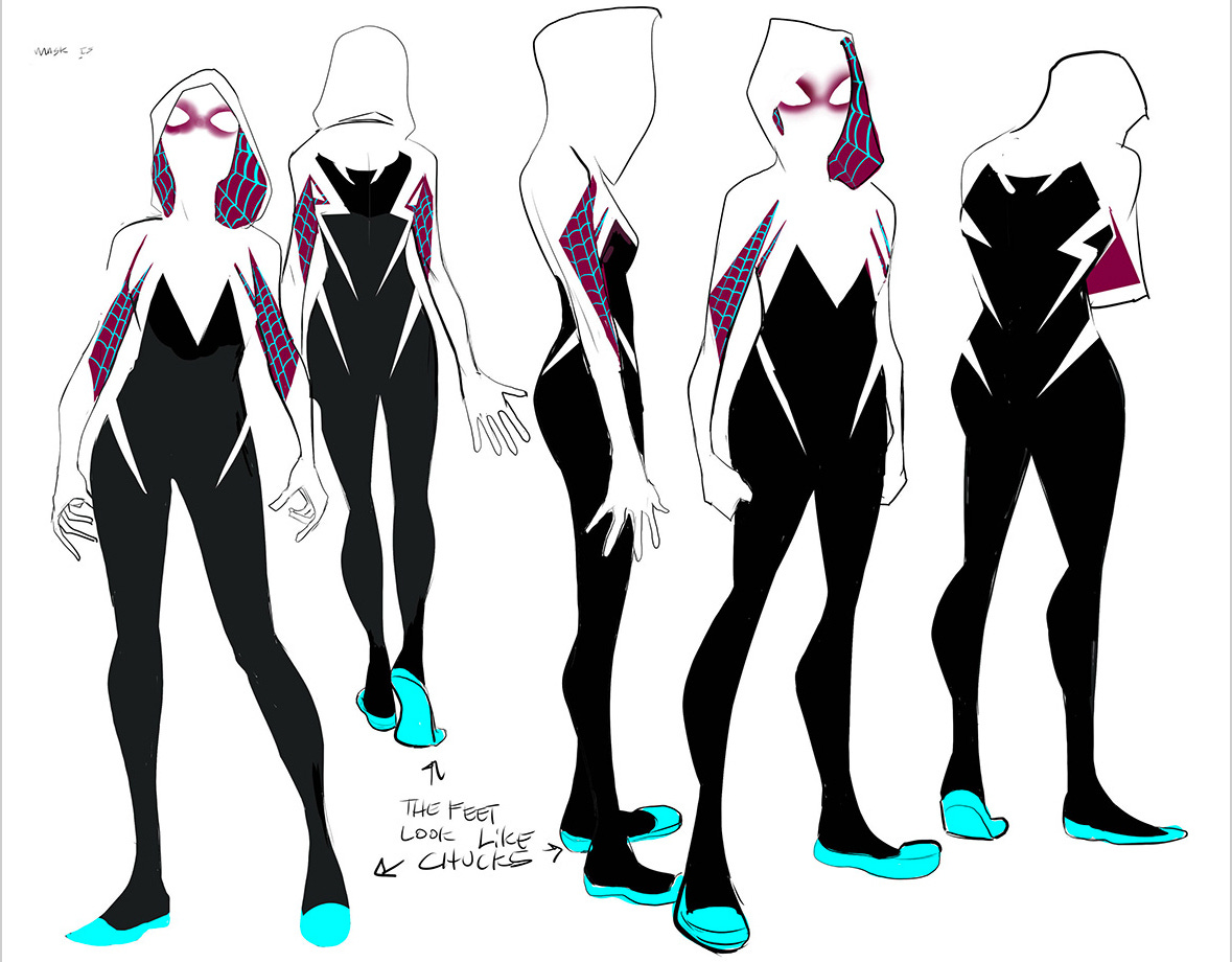
There’s no other way to say it: Like The Phantom, Ghost-Spider’s costume is utterly simple.
And like The Phantom, only small areas of her costume are the busiest parts of it but by themselves, they are neither complex nor convoluted. The rest of the costume is ruled by minimalism.
Even though there’s no outright spider symbol on her costume the way Spider-Man has, the whites of her costume reflects a (relatively abstract) arachnid element and it is paired with the webbing pattern, we are automatically provided the costume’s theme, giving us a check for both simplicity and theme.
As you can see above, even with designs that don’t follow Guidelines #1 or #2, simplicity is a reliable option when pairing an element to a costume’s theme. Complex designs are not always the best option. However, if you decide on a complex design, avoid going with random elements. Think it through and choose well.
Should you choose this guideline, make sure that no part of the costume is overly busy or has competing elements. Also make sure that it looks “complete” by itself without the need for a focal point or unusual element.
Think of Black Panther. When his costume began abstaining from his cape, his look became the embodiment of the principle of minimalism. There was only one color in his costume and with just the feline-theme cowl and clawed gloves, his costume look complete.
")
This design for Black Panther became his longest standing one. Even more modern interpretations of his costume had a degree of fidelity to this design and its simplicity.
Other famous examples that fall in this category are Aquaman and Nightwing (90’s design). Mainstream examples outside of Marvel and DC include The Tick and Supreme.
In the indie comics sphere, a great example that showcases Guideline #3 is
So there you have it.
Three effective general guidelines, all centering around a theme paired with another powerful design approach. Following any one of them can not just inform every facet of your character’s design, but it can also help you streamline your entire process.
Of course, it’s not necessary to follow them.
Feel free to create your own guidelines.
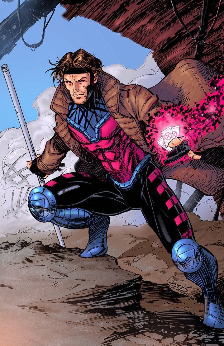
After all, some of popular superhero designs don’t contain an apparent theme. In such cases, I’ve found that a combination of pairing something ordinary with the extraordinary is a very common approach.
Think of Gambit with his ordinary trench coat paired the unique costume underneath…
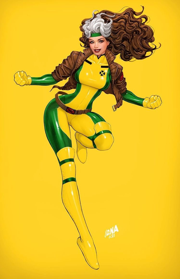
Or Rogue with her most famous design, which of course combines a leather jacket with her yellow and green costume….
There are quite a few other ways to approach a design that don’t follow any of the guidelines proposed above, but I think that’s a post for another day.
Thanks for reading and if you enjoyed this, please subscribe!
Coming next: Practical applications of the guidelines above. I’ll talk about how to make specific choices on a design after you’ve chosen the guidelines above and I’ll also talk about my own creative process when designing characters.